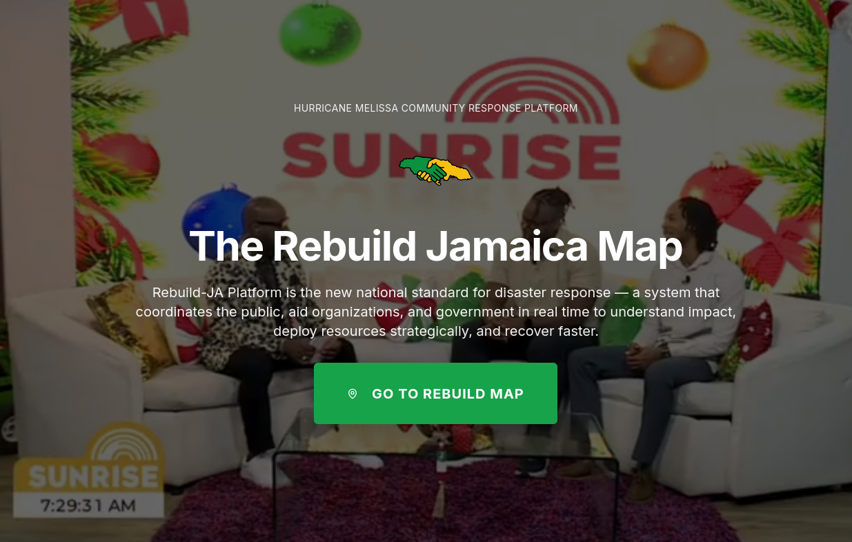
After Hurricane Melissa, Brian messaged me on Instagram. He sells me a vision his friend Travis has, on a solution. I message them back on Whatsapp.
What started as a conversation between three people quickly became something bigger. Old university friends. Current friends. Good friends. New friends. The team formed organically—people who believed Jamaica deserved better disaster response infrastructure. It wasn’t just Brian and Travis. It was us. All of us.
The Problem
Jamaica moves slow. We’re reactive.
When disasters hit, we respond. We scramble. We do our best with incomplete information. Communities that are popular on IG and TikTok get help. Rural communities get forgotten.
That’s not because Jamaicans don’t care. It’s because we lack coordination.
Never in my life I would think we would see a Hurricane to beat Guilbert.
Huricane Melissa, which defined a generation with its death and destruction, gave birth to an initiative to answer a simple question:
What if disaster response teams could see every community’s status at a glance?
- JPS status: Communities with/without electricity
- NWC status: Communities with/without water
- Road access: Accessible vs marooned areas
- Internet: Connected vs disconnected regions
Real-time. Coordinated. Data-driven.
That’s not innovation. That’s basic competence. But it requires something deeper: the belief that we can be proactive.
Mapping A Nation: The Geographic Hierarchy Challenge
Here’s the first problem we had to solve: Jamaica has over 2,200 communities.
Try rendering 1,000+ interactive markers on a map. Go ahead. I’ll wait.
Your browser will cry. Your users will leave. Your CPU will sound like a jet engine.
We needed a smarter approach. And to understand it, you need to understand how Jamaica is organized.
The Three-Tier Geographic Structure
Jamaica’s administrative geography follows a clear hierarchy:
14 Parishes (top level) → 63 Constituencies (middle level) → 2,000+ Communities (bottom level, where people actually live)
Each constituency belongs to a parish. Each community belongs to a constituency. This nested structure gave us the key to solving our rendering problem.
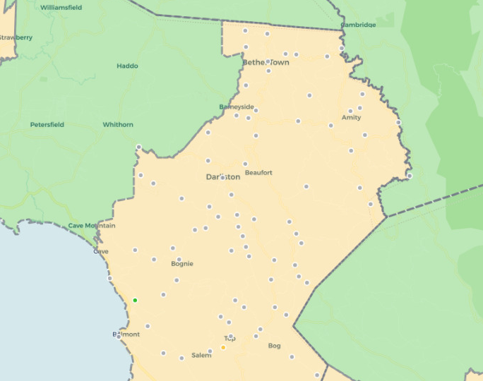
The Aggregation Strategy
Instead of showing 2,000 dots at the national level, we show 63 polygons (constituencies).
The math is elegant:
- Zoom out (national view): Show 63 constituency polygons with aggregated statistics
- Zoom in (constituency view): Show individual community markers for that constituency only
But the implementation? Not so simple.
We had to:
- Fetch and parse constituency boundary data (GeoJSON polygons are heavy)
- Aggregate community stats by constituency as data updates in real-time
- Calculate infrastructure percentages for each constituency (water, electricity, road access, internet)
- Color-code polygons based on problem severity
- Handle the switch between constituency view and community view smoothly
Here’s what the aggregation logic looks like:
function aggregateCommunitiesByConstituency(communities, constituencies) {
  return constituencies.map(constituency => {
    // Filter communities belonging to this constituency
    const communitiesInConstituency = communities.filter(
      c => c.CONSTITUENCY === constituency.name
    );

    // Calculate statistics
    const stats = {
      total: communitiesInConstituency.length,
      marooned: countByStatus(communitiesInConstituency, 'high_priority'),
      in_progress: countByStatus(communitiesInConstituency, 'medium_priority'),
      restored: countByStatus(communitiesInConstituency, 'low_priority'),

      // Infrastructure stats
      withWater: countWithInfrastructure(communitiesInConstituency, 'water'),
      withElectricity: countWithInfrastructure(communitiesInConstituency, 'electricity'),
      withRoadAccess: countWithInfrastructure(communitiesInConstituency, 'road'),

      // Calculate problem percentage
      problem_percentage: calculateProblemPercentage(communitiesInConstituency)
    };

    return {
      ...constituency,
      stats,
      // Determine problem severity for color-coding
      severity: calculateSeverity(stats)
    };
  });
}
This single optimization reduced initial load time from ~8 seconds to under 1 second.
Why This Matters For Disaster Response
During a disaster, response teams need different levels of detail:
- National coordination teams need to see: “Which constituencies have the most problems?”
- Regional response teams need to see: “Which specific communities in our constituency need help?”
- Field workers need to see: “What’s the status of this specific community I’m visiting?”
The three-tier hierarchy lets each user operate at their level of concern. National coordinators aren’t overwhelmed by 1,000 data points. Field workers aren’t limited to abstract summaries.
It’s the right abstraction for the problem space.
How Do You Sync Without Breaking?
Disaster response is inherently real-time. A community loses power. A road becomes inaccessible. Aid arrives. The map needs to reflect these changes immediately.
But here’s the catch: multiple organizations are updating the same data simultaneously.
NGOs in Kingston. Government agencies in Montego Bay. Field workers in rural parishes. All clicking buttons, changing statuses, reporting infrastructure updates.
When I got to France for my Masters at EURECOM, I had roommates working in cloud systems. One late night, I was explaining this multi-user sync problem to him over “coffee”.
He introduced me to an architectural pattern that changed everything: treat disaster data as a distributed state problem, not just a database problem.
The cloud solution we learned about handled most of the complexity:
- Real-time subscriptions (push updates to all connected clients instantly)
- Optimistic UI updates (show changes immediately, sync in background)
- Conflict resolution (when two users update the same community simultaneously)
- Offline support (field workers often have spotty connectivity)
But we still had to design our data model carefully.
The Community Status State Machine
We defined community statuses as an enumerated type:
low_priority: Restored, no major issuesmedium_priority: Some infrastructure missing, work in progresshigh_priority: Marooned, critical needsunknown: No data yet
But the transitions between these states had to be carefully managed. You can’t go directly from high_priority to low_priority—that would hide important historical context.
We needed state validation:
// State transitions must follow logical progression
const validTransitions = {
  'unknown': ['low_priority', 'medium_priority', 'high_priority'],
  'high_priority': ['medium_priority'], // Can't skip to low_priority
  'medium_priority': ['low_priority', 'high_priority'],
  'low_priority': ['medium_priority'] // Things can get worse
};

function validateStatusTransition(currentStatus, newStatus) {
  const allowed = validTransitions[currentStatus] || [];
  if (!allowed.includes(newStatus)) {
    throw new Error(`Invalid transition: ${currentStatus} -> ${newStatus}`);
  }
  return true;
}
This prevents data corruption and ensures we maintain audit trails for disaster response coordination.
The Infrastructure Data Problem (Or: The Boolean Trap)
Early on, we tracked infrastructure with simple booleans:
hasWater: true/falsehasElectricity: true/falsehasRoadAccess: true/falsehasInternet: true/false
Simple, right?
Wrong.
Boolean data lies. Here’s why:
hasWater: falsecould mean “no water” or “we haven’t checked yet”hasElectricity: falsedoesn’t tell you if it was never restored or if it was restored and then lost againhasRoadAccess: falsedoesn’t distinguish between “impassable” and “only accessible by 4x4”
We needed three-state logic: true, false, and unknown (null).
But that created UI challenges. How do you display “unknown” infrastructure status without confusing users? How do you filter communities when some have incomplete data?
We solved it with explicit filter options:
- Has Water vs Missing Water vs Unknown Water Status
- Multi-select filters that let users say “show me communities with water OR unknown water status”
- Clear visual indicators (✓ for has, ✗ for missing, ? for unknown)
Sounds trivial, but getting this UX right took weeks of iteration.
The lesson: In disaster response, “unknown” is just as important as “yes” or “no.” It tells you where you need to send assessment teams first.
The Mobile Challenge
70% of our users access Rebuild-JA on mobile devices. Many are field workers or community organizers who don’t have laptops.
Maps are fundamentally designed for mouse interaction. Hover tooltips, click events, zoom controls—all assume a mouse.
Mobile broke all of that.
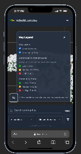
The Bottom Sheet Solution
We implemented a mobile-first redesign:
- No hover tooltips (they don’t exist on touch devices)
- Larger tap targets (fingers are bigger than mouse cursors)
- Bottom sheet UI (instead of sidebars that cover the map)
- Gesture-based navigation (swipe to close panels, pinch to zoom)
But the trickiest part? Tapping a community marker while also allowing map panning.
Leaflet’s default behavior is: “any touch event on a marker is a click.” But users wanted to pan the map by dragging across markers.
We had to implement touch intent detection:
- Touch start + immediate touch end = marker click
- Touch start + movement > 10px = map pan (ignore marker)
- Long press = show context menu
This required diving into Leaflet’s event system and carefully managing event propagation:
marker.on('click', (e) => {
  // Stop propagation to prevent constituency click
  L.DomEvent.stopPropagation(e);

  // Only trigger on actual clicks, not drags
  if (!isDragEvent(e)) {
    handleCommunityClick(community);
  }
});
Years earlier, I’d built a similar map system at Digicel—tracking field engineers across the Caribbean in real-time. Everyone told me it was overengineered. That nobody would use it. That its just giving the team one more tool that will break. But when it launched, teams across Jamaica and Trinidad actually used it. For years.
That experience taught me that Leaflet could handle production workloads at Caribbean scale. So when the team came together to choose a map library for Rebuild-JA, we didn’t hesitate.
Not because Leaflet was durable or industry standard. But because we were biased as hell—and sometimes experience is just bias that worked out.
Where does the Disaster Data live ?
Fair question. Disaster data is sensitive. It reveals which communities are most vulnerable. It’s not the kind of information you want on servers you don’t control.
This forced us to rethink our infrastructure strategy:
- Cloud-hosted managed services (fast to deploy, easy to scale) vs
- Self-hosted regional instances (data sovereignty, government control)
We haven’t fully solved this yet. But we’re exploring a hybrid approach:
- Metadata and authentication: Centralized cloud service
- Community data and reports: Regional instances, government-controlled
- Real-time sync: Federated architecture across regions
It’s complex. But it’s the right kind of complex—the kind that respects sovereignty while enabling cross-border disaster coordination.
Colorblind Users, We Exist
About 8% of men (and 0.5% of women) have some form of color vision deficiency. Our initial map used red/yellow/green to indicate community status.
Red-green colorblindness made this completely unusable for ~8% of our users.
We implemented a colorblind mode that switches to blue/orange/purple color schemes with higher contrast. But we also added:
- Pattern fills (diagonal lines, dots, solid) in addition to colors
- Text labels on constituency polygons
- High-contrast outlines on all markers
Accessibility isn’t optional when you’re building disaster response tools. If 8% of emergency responders can’t use your map, people suffer.
The Performance Optimization Journey (Or: 1000ms To First Paint)
Initial load time for the map was ~8 seconds. Unacceptable.
We profiled the app and found the bottlenecks:
- Database query returning 1000+ communities: 2.5s
- GeoJSON parsing and Leaflet marker creation: 3.2s
- Constituency boundary rendering: 1.8s
- JavaScript bundle size: 0.5s
Optimization 1: Pagination
Instead of fetching all 2000+ communities at once, we implemented cursor-based pagination:
let allCommunities = [];
let from = 0;
const pageSize = 1000;
let hasMore = true;

while (hasMore) {
  const { data, error } = await supabase
    .from('communities')
    .select('*')
    .order('name')
    .range(from, from + pageSize - 1);

  allCommunities = [...allCommunities, ...data];
  from += pageSize;
  hasMore = data.length === pageSize;
}
This didn’t reduce total load time, but it gave us progressive rendering—show constituencies first, stream in communities as they load.
Optimization 2: Layer Management
We separated map layers:
- Parish boundaries (always visible, 14 polygons)
- Constituency boundaries (visible at national level, 63 polygons)
- Community markers (visible at constituency level, ~1000 markers)
Leaflet only renders layers that are currently added to the map. By conditionally adding/removing layers based on zoom level, we reduced active DOM elements by 80%.
Optimization 3: Tile Layer Caching
Map tiles (the background imagery) were being re-requested on every dark mode toggle. We implemented client-side tile caching with maxAge headers and Service Worker integration.
Result: Load time dropped from 8 seconds to under 1 second. Time to interactive: 1.2 seconds.
What The Cloud Architecture Taught Me
That conversation with my roommate about cloud architecture wasn’t just about technology. It was about mindset.
He taught me that modern cloud systems aren’t just about hosting—they’re about patterns.
- State synchronization patterns for real-time collaboration
- Eventual consistency patterns for offline-first apps
- CQRS patterns (Command Query Responsibility Segregation) for separating reads from writes
- Event sourcing patterns for audit trails and historical data
These patterns solved problems I didn’t even know I had. And they did it in ways that were elegant, maintainable, and scalable.
We didn’t reinvent any wheels. We used a managed cloud solution that implements these patterns out of the box. But understanding the why behind the architecture made all the difference.
When you know why eventual consistency matters, you design your UI differently. When you understand event sourcing, you think about data differently. When you grasp CQRS, you structure your API differently.
That’s the value of learning from people who’ve already solved these problems.
The Challenges We’re Still Figuring Out
Here’s the honest part: the team doesn’t have all the answers.
Scaling to multi-island deployment? We’re community-scale in Jamaica right now. Expanding to Barbados, DomRep, Trinidad, Haiti—each with their own government systems, data requirements, and disaster protocols—is a different beast entirely.
Government adoption and integration? Getting official government buy-in means integrating with legacy systems, meeting compliance requirements, and navigating bureaucracy. The technology is ready. We still trying to make lawyer friends 😭
Sustainability? Cloud hosting costs scale with usage. If Rebuild-JA becomes the official disaster response platform for multiple Caribbean nations, who pays for the infrastructure? We’re applying for grants, exploring nonprofit partnerships, and considering freemium models.
These aren’t technical problems. They’re systems problems. And they require collaboration across sectors.
Teamwork Was The Key
None of this happens alone.
The team was the real infrastructure. Old classmates who understood the technical challenges. Current friends who knew the political landscape. Good friends who volunteered their weekends. New friends who brought fresh perspectives.
When we hit roadblocks—and we hit many—someone in the team knew someone who knew someone. That’s how things work in Jamaica. That’s how things work in the Caribbean.
Brian and Travis had the vision. But the execution? That was all of us. Late-night debugging sessions. Whiteboard sessions about data models. Arguments about color schemes and user flows. Celebrating small wins. Picking each other up after setbacks.
Building disaster response infrastructure for your country isn’t a solo mission. It’s a team sport. And we had a hell of a team.
The Feeling
You know what it feels like to build something people said wouldn’t work—and then watch it succeed?
It’s addictive.
Addictive because validation feels better than doubt. When field workers tell the team the map helped them coordinate aid delivery. When CVM Sunrise offers interviews. When officials ask to use the platform for the next hurricane season. When other Caribbean nations reach out about deployment.
That’s not ego. That’s impact.
But it’s terrifying because the stakes are real. When the map goes down during a disaster, people suffer. When the data is wrong, resources get misallocated. When the UI is confusing, response teams waste time.
This isn’t a side project. It’s infrastructure. And infrastructure has to work.
That’s what people don’t understand about building for your country. There’s no room for “move fast and break things.” There’s only: move thoughtfully and build things that last. Otherwise, rampant corruption.
We carry that responsibility together.
If You’re Building Something
And people are telling you it won’t work. That it’s too hard. That nobody will use it. That you’re wasting your time.
Build it anyway.
Find your team. Find people who believe. Because maybe—just maybe—five years from now, you’ll be using those lessons to build something again. Together.
And that’s the real story.
Not the technology. Not the tools. Not even the app itself.
The story is that we believed when nobody else did.
We built it anyway. Together.
Rebuild-JA is looking for people like that.
Visit rebuild-ja.com